Competing and Collaborating Designers
We embrace a philosophy of both competition and collaboration.
By sharing space and time, we foster individual creativity while unlocking the potential for collective innovation.
This collaborative environment is where unique concepts and diverse expressions emerge.
In the HISTORY section, we feature the career and achievements of Tadatoshi Sato,
founder of THE DESIGN ASSOCIATES, as an archive.
History
As a young creator, Sato was inspired by American cutting-edge design. Encouraged by his university mentor, he moved to Los Angeles in 1970 and enrolled at the Art Center College of Design, known especially for its transportation design program.
After graduation, he moved to San Francisco to join Landor Associates. At that time, Landor’s headquarters was a renovated ferryboat called the “Klamath,” moored at San Francisco Bay. The firm worked on projects with international clients, including Japanese corporations. While at Landor, Sato worked with major airline companies such as Thai Air and US Air. He was deeply inspired by the dynamic and innovative design process at Landor.
 1
1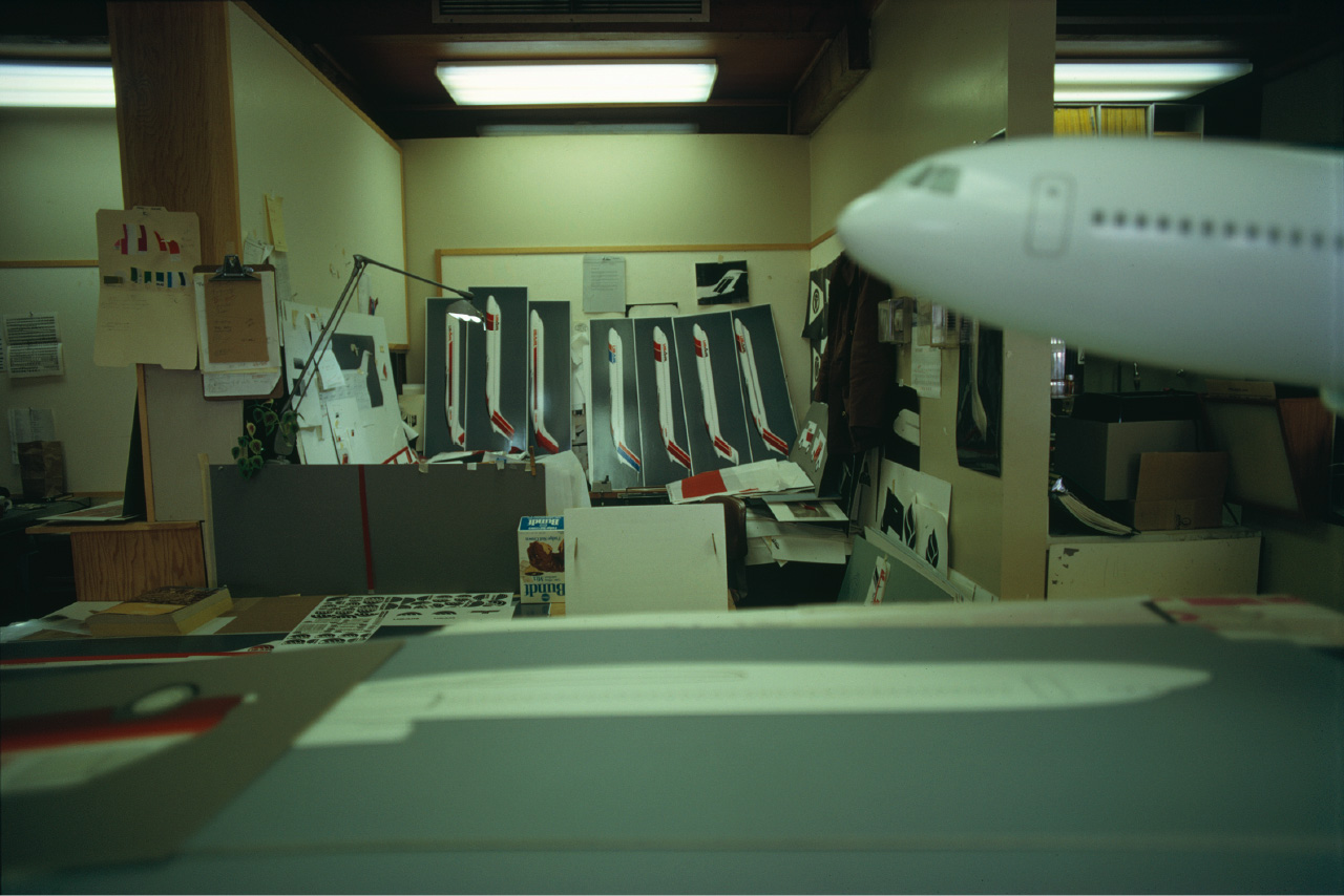 2
2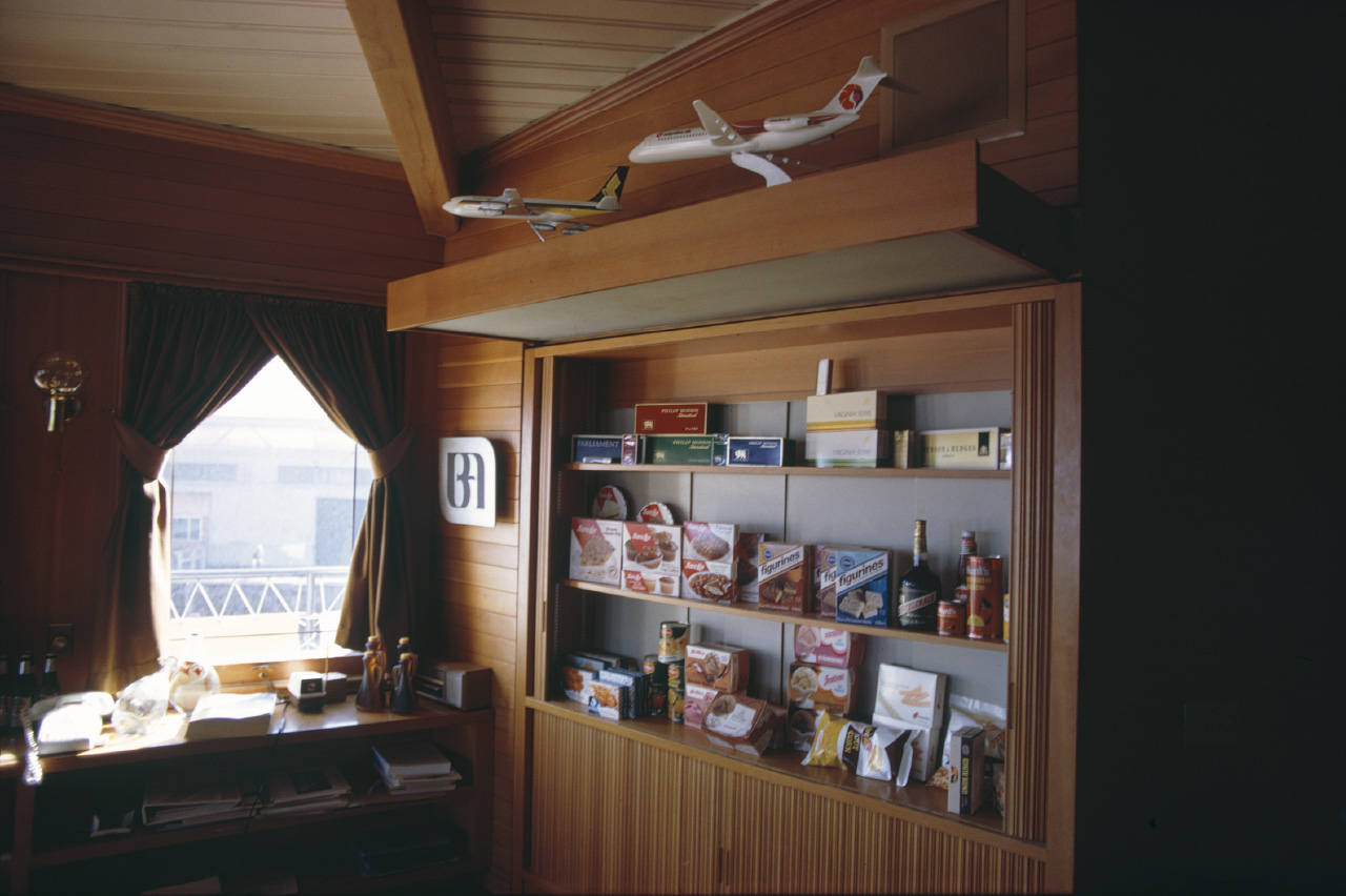 3
3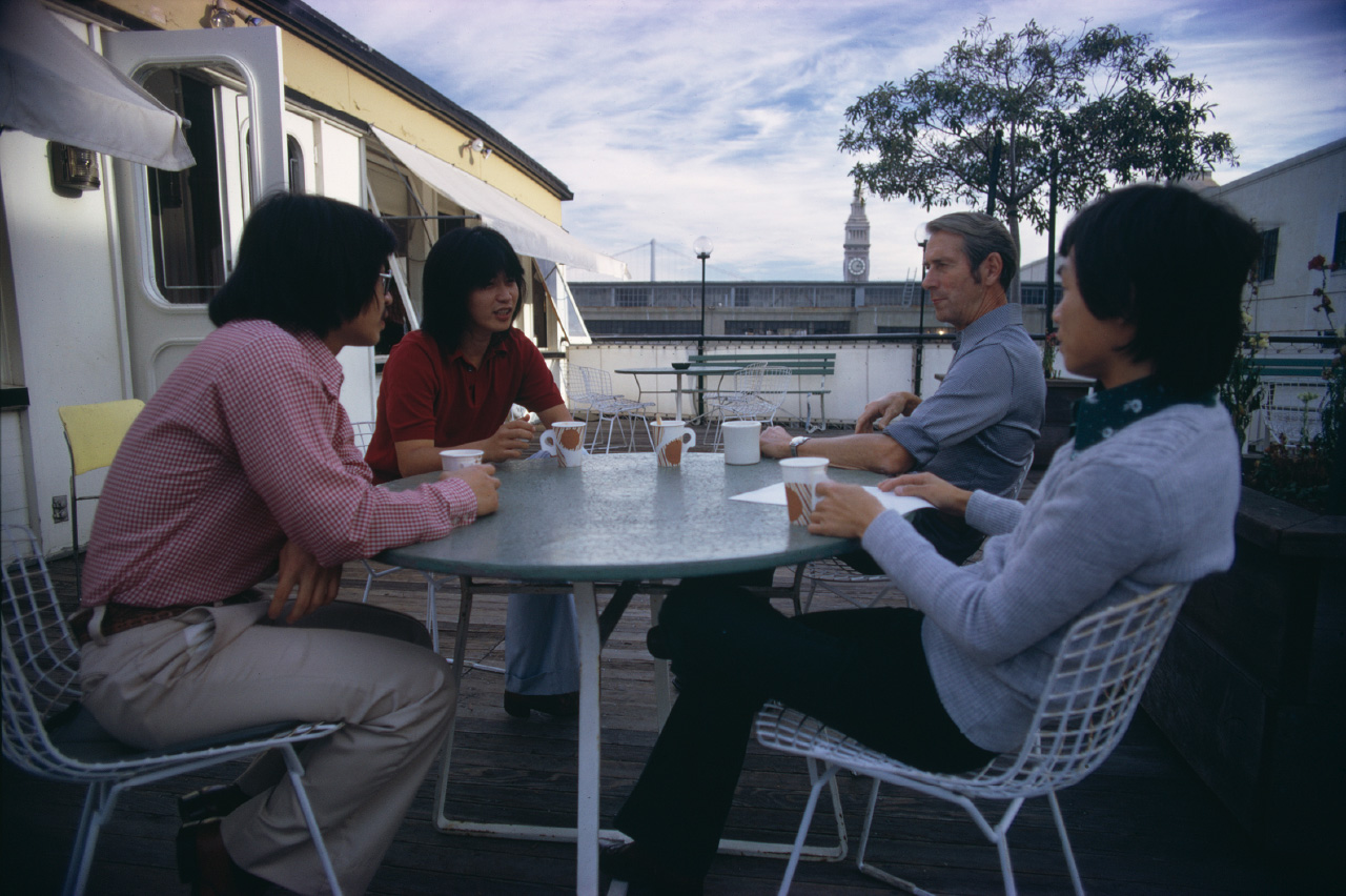 4
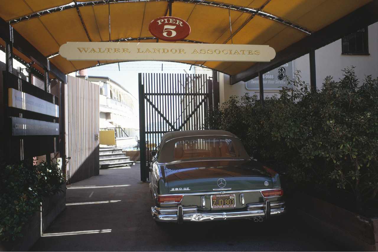
4The headquarters “Klamath” docked at Pier 5. CEO Walter Landor’s beloved Mercedes cabriolet (with a bent bumper).
2.Work desk aboard the Klamath.
An airline logo design in development.
For the initial internal meeting the appraisal focused on the aircraft’s graphics.
3.The archive room inside the Klamath.
Aircraft models and packaging materials that were used during the presentation.
4.Taking a break on the deck of the Klamath. There were fellow Asian employees at the firm.
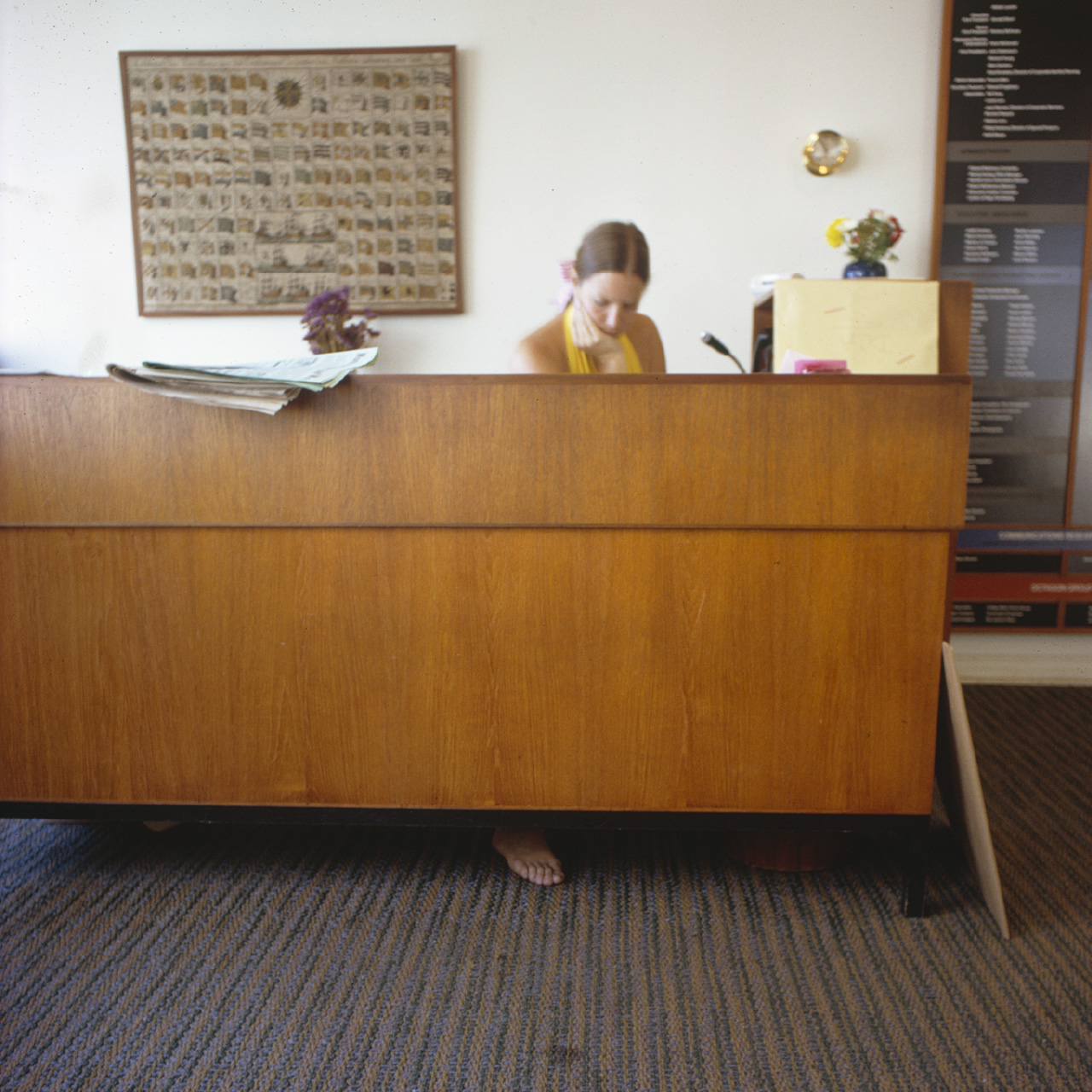
5.The barefooted receptionist.
Everyone adopted a laid-back California style.
 5
5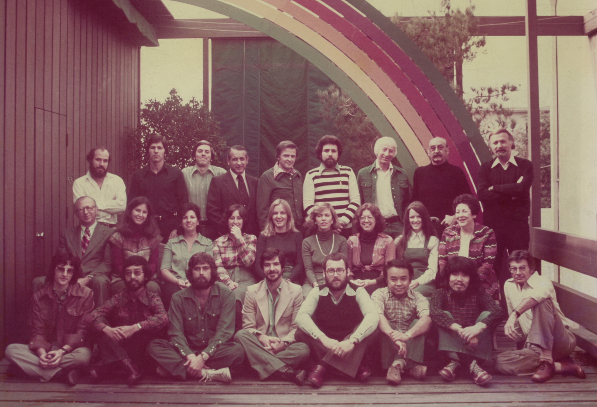 6
6 7
7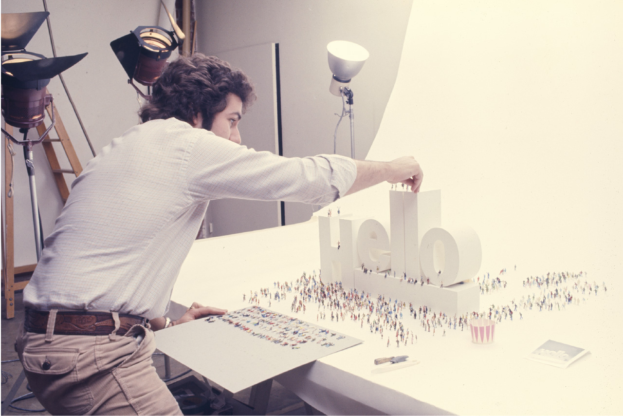 8
8Saul Bass is second from the right in the back row. Sato is second from the left in the front row.
7.The entrance to the office which was located on Sunset Boulevard, just two blocks from Grauman’s Chinese Theatre.
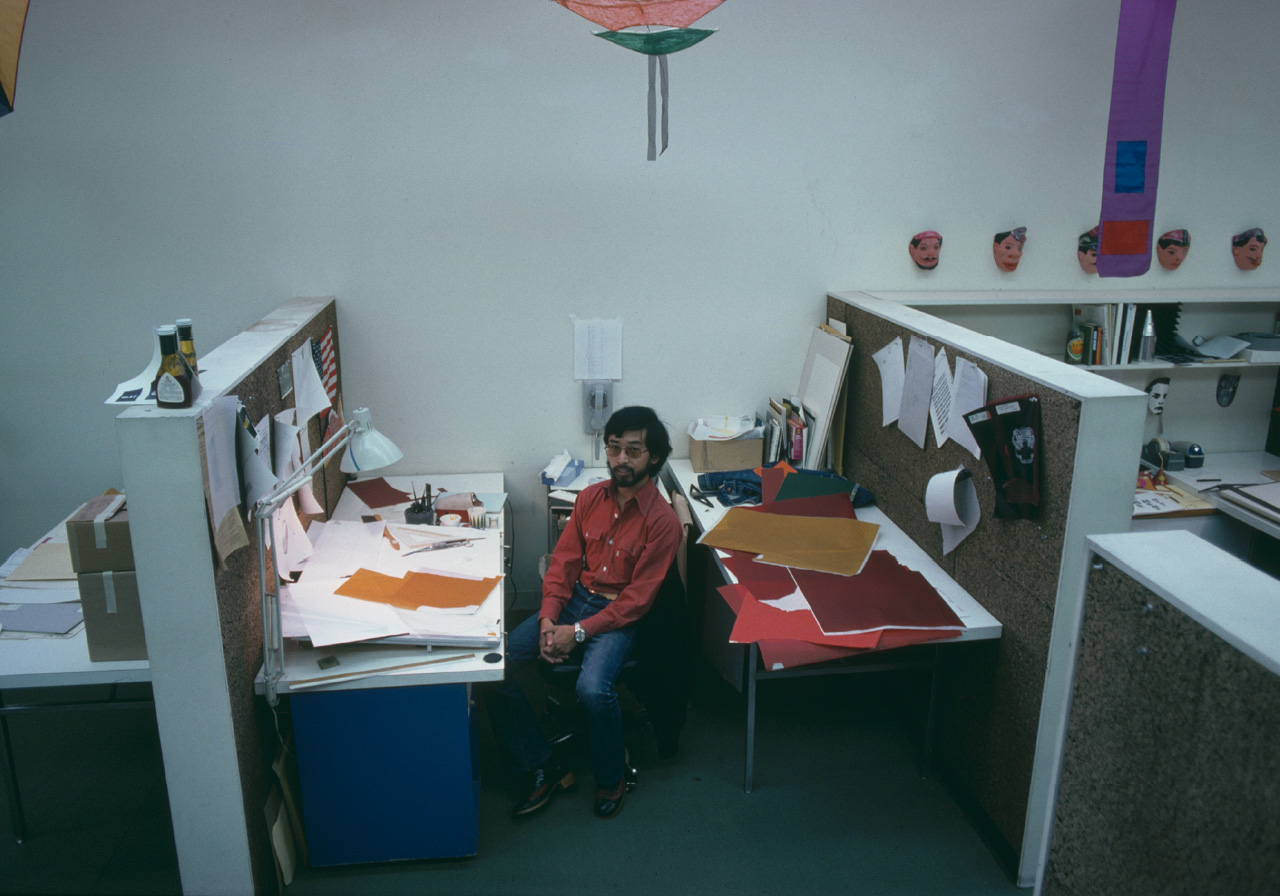
8.Sato’s colleague, Steve Bernstein, setting up the shoot for the AT&T telephone book cover design.
9.PANTONE overlays, now relics of a bygone era, lie scattered on a desk.
 9
9Exciting projects for the airline industry
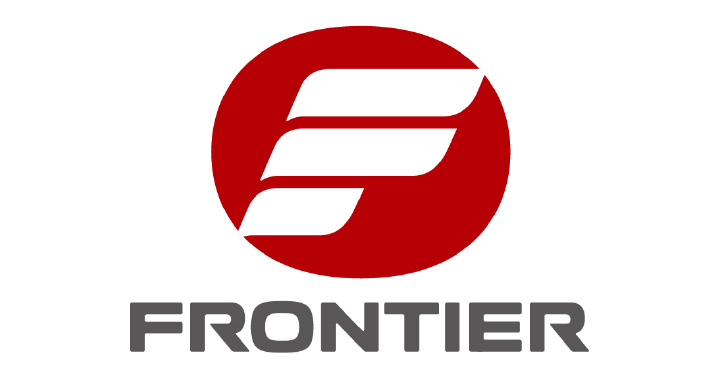
Frontier Airlines (1975)
Sato later moved to Saul Bass and Associates, where he won the design contract for Frontier Airlines in Colorado. This was before the PC era, so client presentations were made by showing hundreds of monochrome hand-drawn designs on walls. Saul Bass, famous for winning the Oscar in 1968 for his short film Why Man Creates, was indeed a brilliant creator. Saul’s ability to craft presentations with a compelling story was unmatched. (Side note: Sato held his Oscar trophy once which was surprisingly heavy).
This logo, which resembles the letter “F” in flight, was also featured in the design magazine IDEA, in its special Saul Bass issue.
In 1976, just before returning to Japan, Sato had the opportunity to work as a freelance designer at Raymond Loewy’s office in New York. Although he never met him in person, Sato was told Loewy remained an energetic designer well into his 90s. Even though it was only for a short period, Sato cherished the opportunity to work in the office of “the father of American industrial design.” And with the foreign exchange rate at 300 yen to the dollar, he earned more than enough to cover his return flight to Japan.
Sato’s six years in the U.S. allowed him to work with several top designers and design directors. These experiences were invaluable when it came time to establish his own design office.
Okinawa CTS (1976)
Sato was asked to design the logo for Okinawa CTS through a Japanese contact he made while working at Saul Bass. After the global oil crisis, Maruzen Oil and Mitsubishi Oil embarked on a joint venture to build an oil reserve base in Okinawa. The theme color of the company logo was bright blue, symbolizing the southern seas, and the design represented the flow of oil being distributed throughout Japan. The hidden meaning in the logo lies in the characters for “Maru” (meaning circle) from Maruzen and “San” (meaning three) from Mitsubishi.

Pelé’s match in Japan marked the formative years of the sports merchandising business
Pelé’s Farewell Game in Japan (1977)
Pelé, the “soccer god,” played his farewell game in Japan, hosted by Dentsu’s Sports and Cultural Business Division. The event became a trailblazer for sports marketing in Japan. Various merchandise displaying the logo helped promote the game, which was considered a huge marketing success. The match was brimming with youthful energy, and soccer fans erupted in joy when Pelé scored his stunning free-kick.
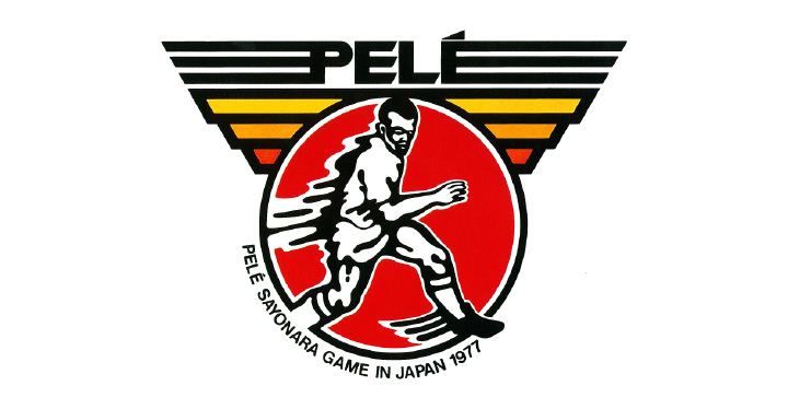
Pelé’s Farewell Game in Japan (1977)
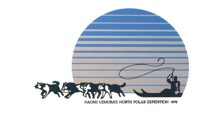
Naomi Uemura’s Solo Expedition to the North Pole (1978)
This logo captured the vast, icy landscape with a gradient of blue, emphasizing the solitude of the journey. It was used for fundraising and was printed on the sails of the dog sleds. Uemura (who disappeared in 1984 while descending Mount McKinley) had a shy smile that remains in Sato’s memory to this day.
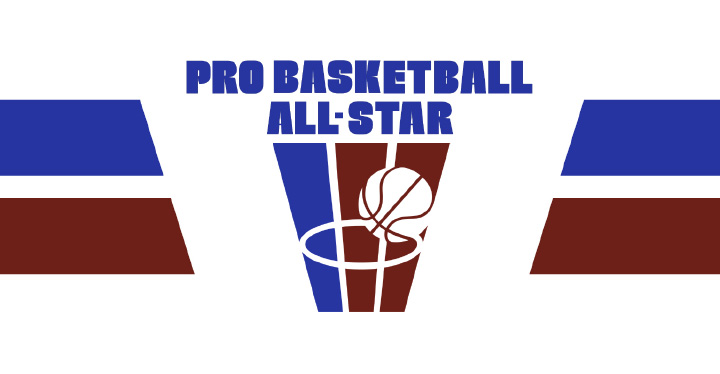
Pro Basketball All-Star (1978)
Dentsu hosted the inaugural NBA All-Star Game at Tokyo’s Yoyogi National Gymnasium, bringing together the top athletes from the Eastern and Western Conferences for a thrilling showdown. The logo, featuring the brown color of a basketball, was overlayed with the American-flag’s red and blue, and became the symbol of the event. The FEN broadcast hit its climax when Laker star Kareem Abdul-Jabbar made his miraculous skyhook.
Designing Logos for Historically Iconic Sports Events
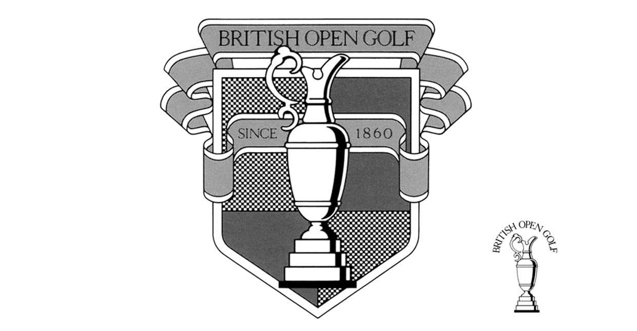
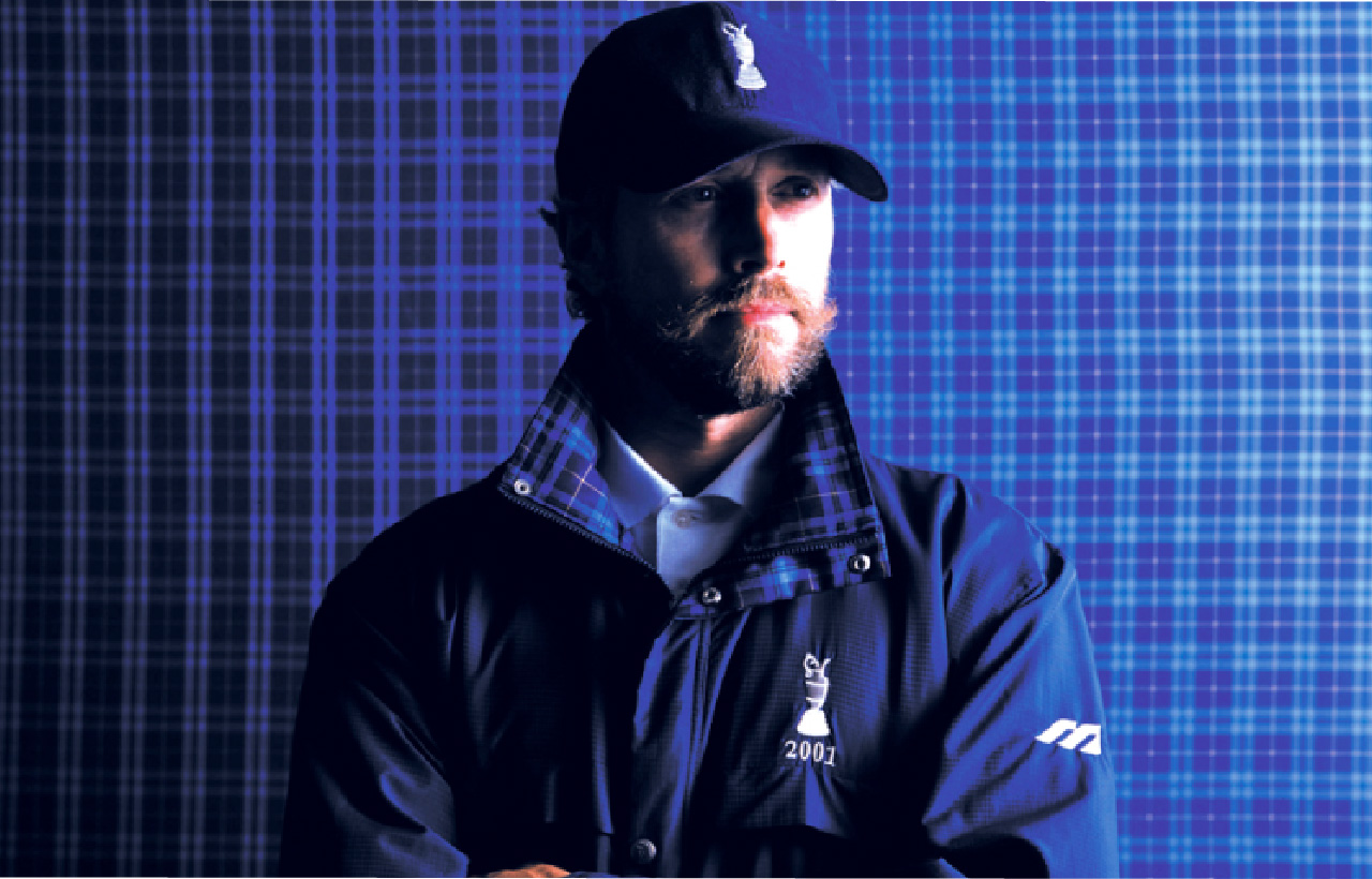
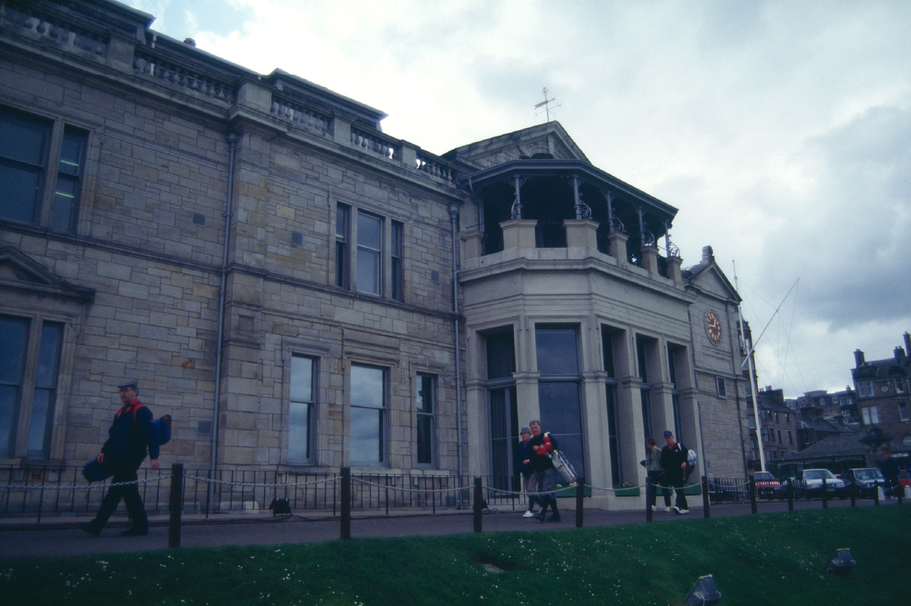
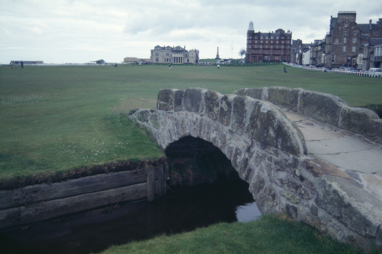
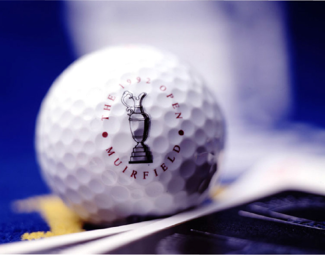
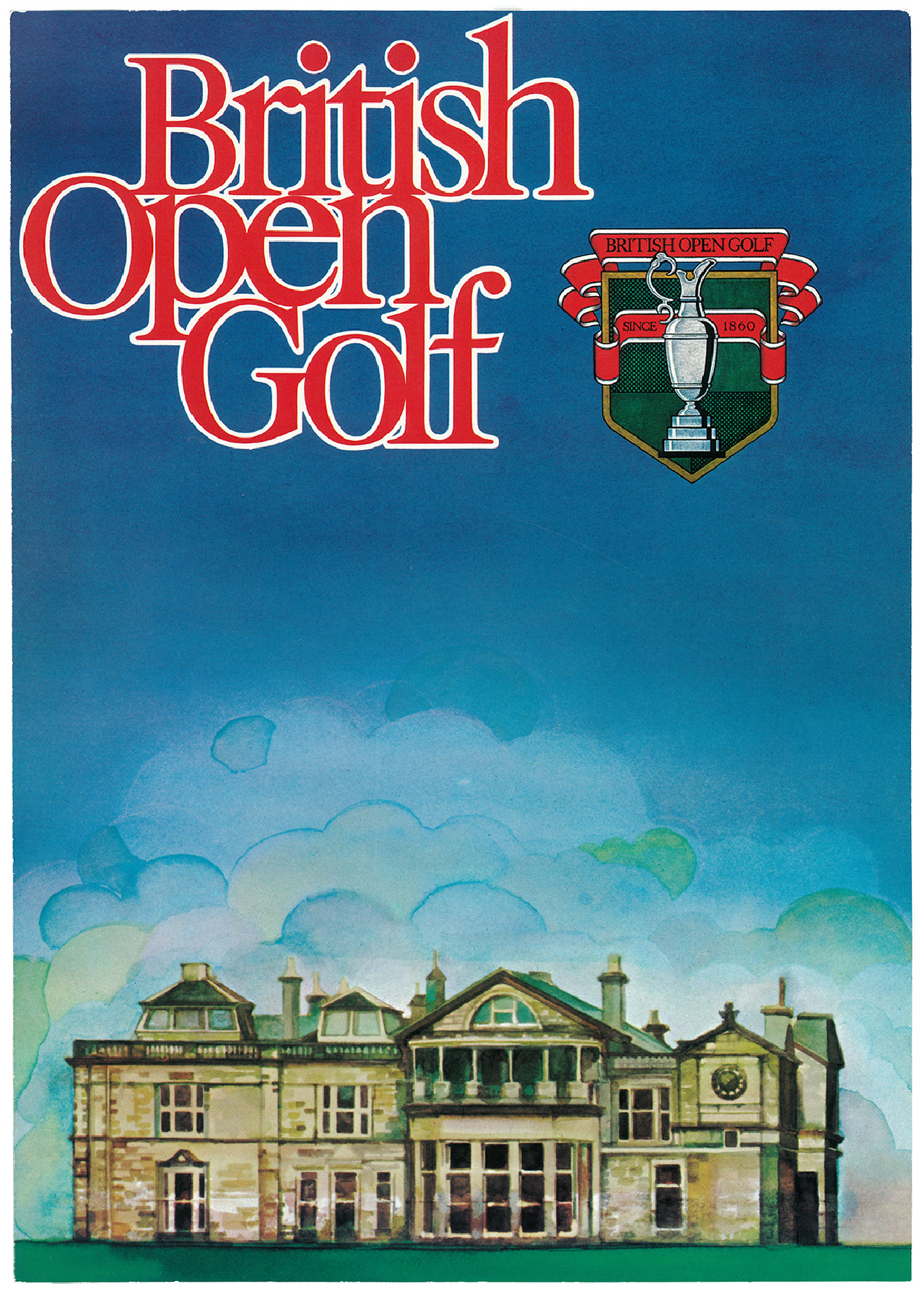
The British Open (1978)
The oldest golf tournament in the world had no logo at the time. Dentsu requested that Sato design one, and after researching limited available materials, he created a logo inspired by coats of arms and the tournament’s trophy. Later, he also designed the tartan check pattern for The British Open for Mizuno, which is still registered with the Scotland Tartan World Register.
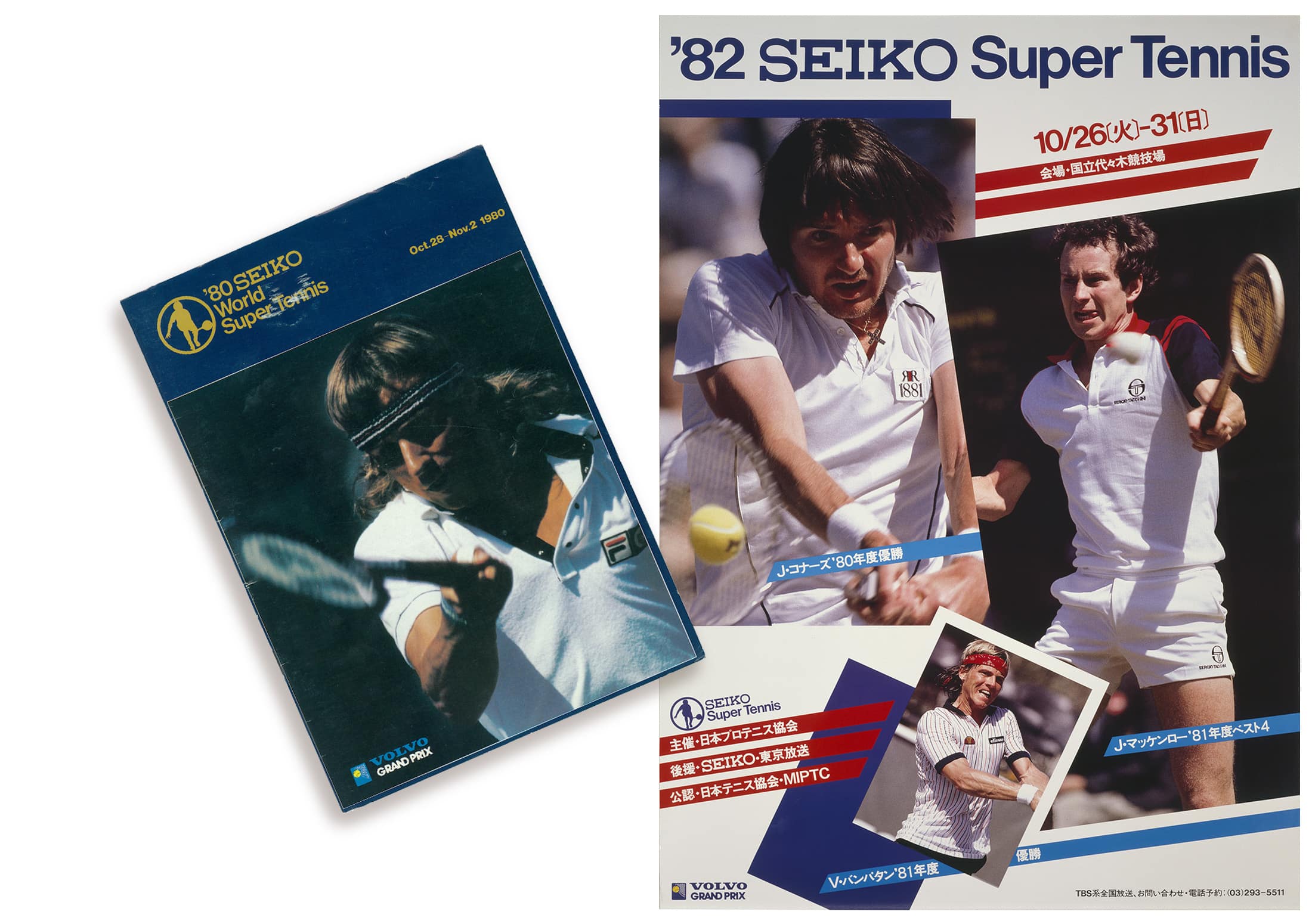
Seiko Super Tennis (1980)
Many companies sponsored tennis tournaments during the height of the tennis boom in Japan. For a tennis enthusiast like Sato, it was a golden era—he played a pivotal role in shaping the visual identity of the sport, overseeing everything from the design of posters, tickets, and catalogs to venue signage and even the color schemes of the courts.
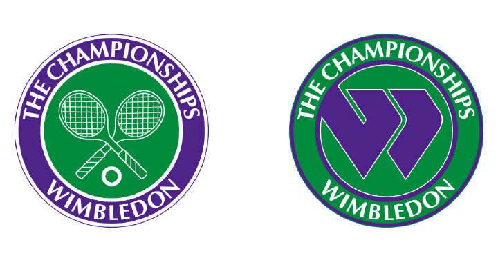
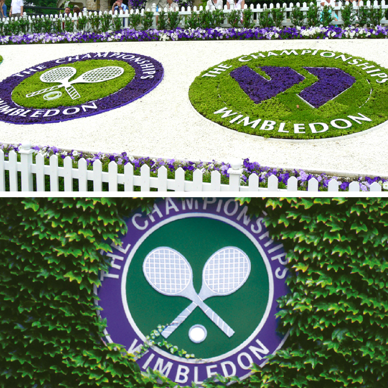
The Championships Wimbledon (1979)
The Championships Wimbledon, the world’s oldest tennis tournament, originally had no official logo. Dentsu commissioned Sato to create one, drawing inspiration from the royal blue of the British monarchy and the grass green of the iconic courts. Two design motifs emerged: one featuring a stylized “W” and the other showcasing crossed tennis rackets. The “W” was widely used in merchandising, and Sato learned it was being referred to as the “Flying W” when he met Virginia Wade, a top British player, at the Federation Cup event held in Tokyo. It was a proud moment when she exclaimed “Oh, you are the designer of Flying W!” The “crossed rackets” design was also used for marketing. The diagonal string pattern references the traditional racket stringing used when the Wimbledon tournament was first held in the late 1800s.
When the logo was first merchandised across various products, the “Flying W” appeared more frequently than the “Crossed Rackets” design, including in separately shot catalog photos. We speculate the “Flying W” was prioritized because it was easier to register as a trademark.
A Company of Competing and Collaborating Designers
Sato once worked as a freelancer at a firm called The Company in Santa Monica, California. The word “company” can be defined as ‘companions’ as well as ‘a corporation’. He felt that “associates,” meaning a group of people working together, was a more fitting name for his own design firm. This is why Sato named his company THE DESIGN ASSOCIATES. This philosophy remains unchanged, and today, it is encapsulated in his design motto of “Competitive and Collaborative Creation.”
December 1980
Sato had planned to eventually open his own firm. Based on his experiences in the U.S., he started a design company focusing on package design and branding in December 1980.