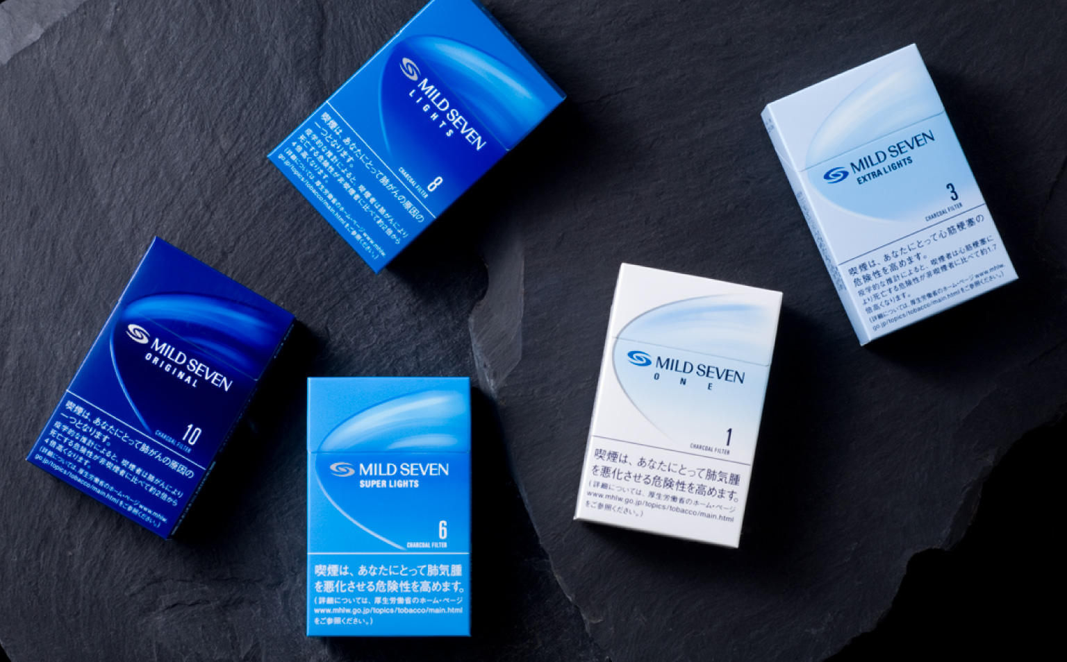
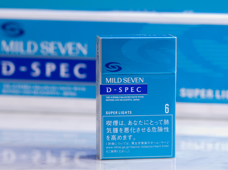
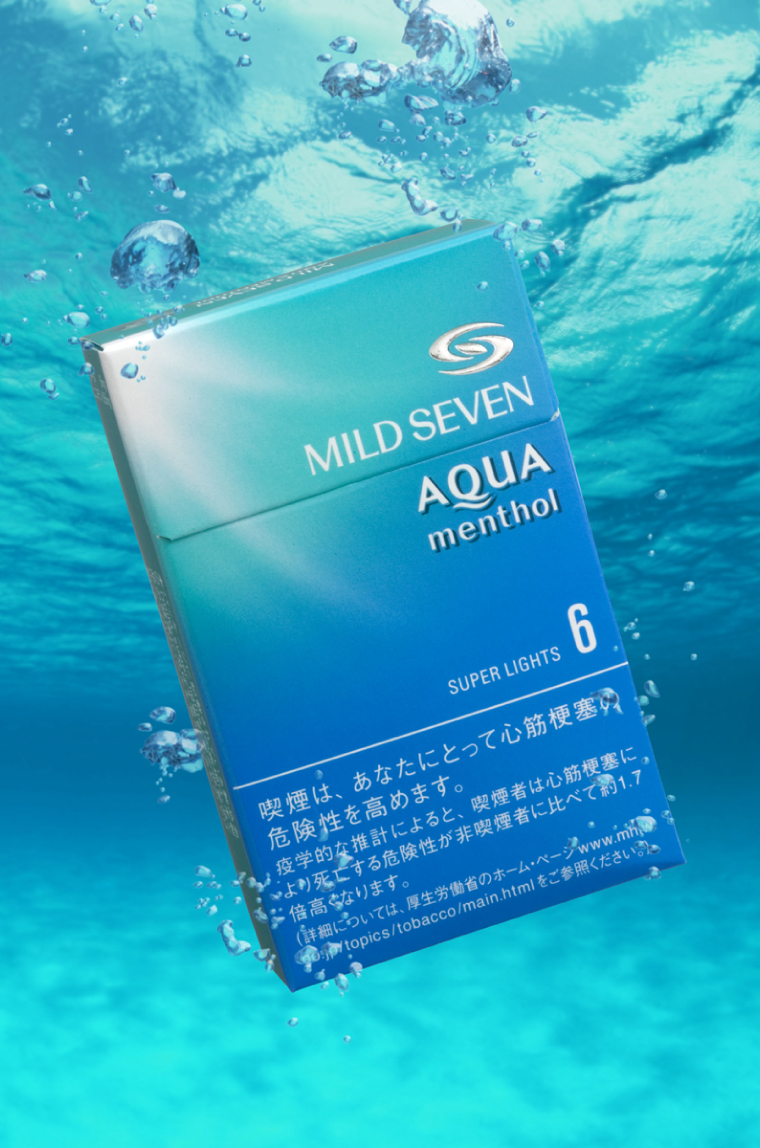
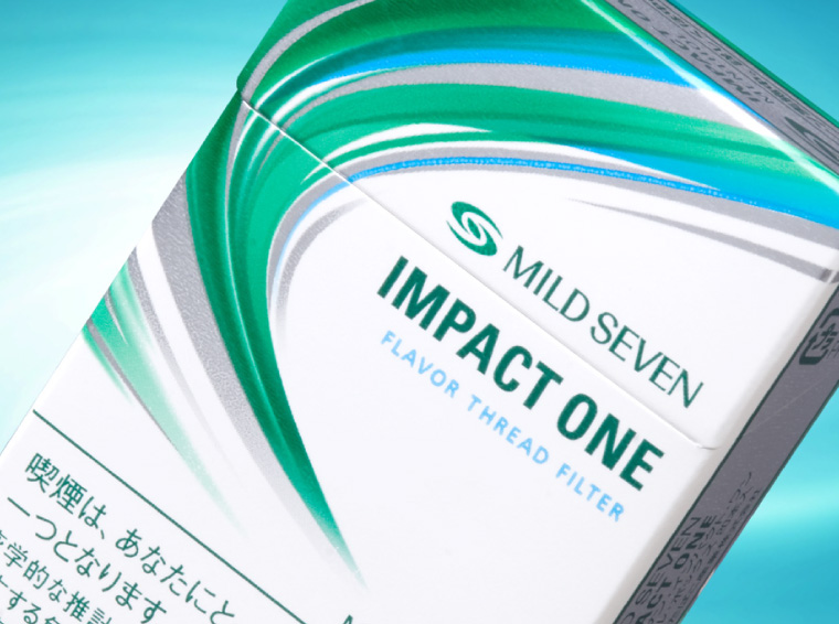
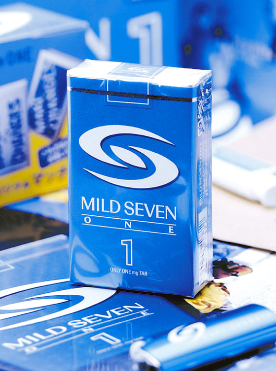
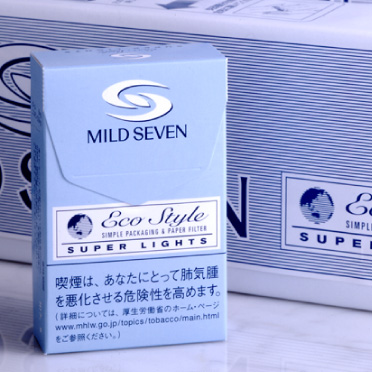
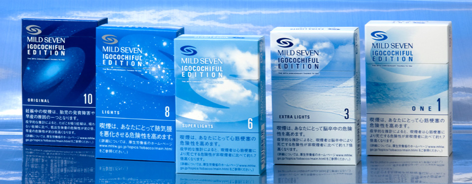
2003年にMとSをかたどったブランドロゴ「ブルーウインド」によるデザインを導入し、パッケージの想起性を高めてきました。多くの人に愛されるNO.1ブランドとして、常に進化するコンセプトと製品群の広がりにフレキシブルに対応し、様々な展開が実現しました。
The cigarette brand Mild Seven tackled the challenge of creating a new symbolic design. The symbolism of the logo was heightened to make it linger in the viewers’ minds whenever encountered. The former image of the brand was retained while adding a youthful dynamism, expressed in a blue and white motif and under the nickname “Blue Wind.” The design can be flexibly adapted to an expanding range of product groups.
香烟品牌“柔和七星”的挑战是象征化设计。意图是使富有记号性的形象在所有场合给人留下记忆。设计继承了该品牌的图形资产,用蓝白的世界表现了年轻的活力。它的昵称为“蓝色的风”。设计亦能灵活地对应产品群的扩展。
Copyright © 2014 The Design Associates Co.,Ltd. All Rights Reserved.